In almost completing my seventh course in my long-running series on getting my Meta Front-End Certificate. I learned some basics of the design platform called Figma.
As a quick refresher, my last post covered design ideas and the overall rules introduced for good UX (User Experience). However, Figma basics are also taught throughout this course.
Figma is very similar in styling and feel to Canva, another design platform, however Canva is more targeted towards graphic design and lacks the website / UI that Figma seems to thrive in.
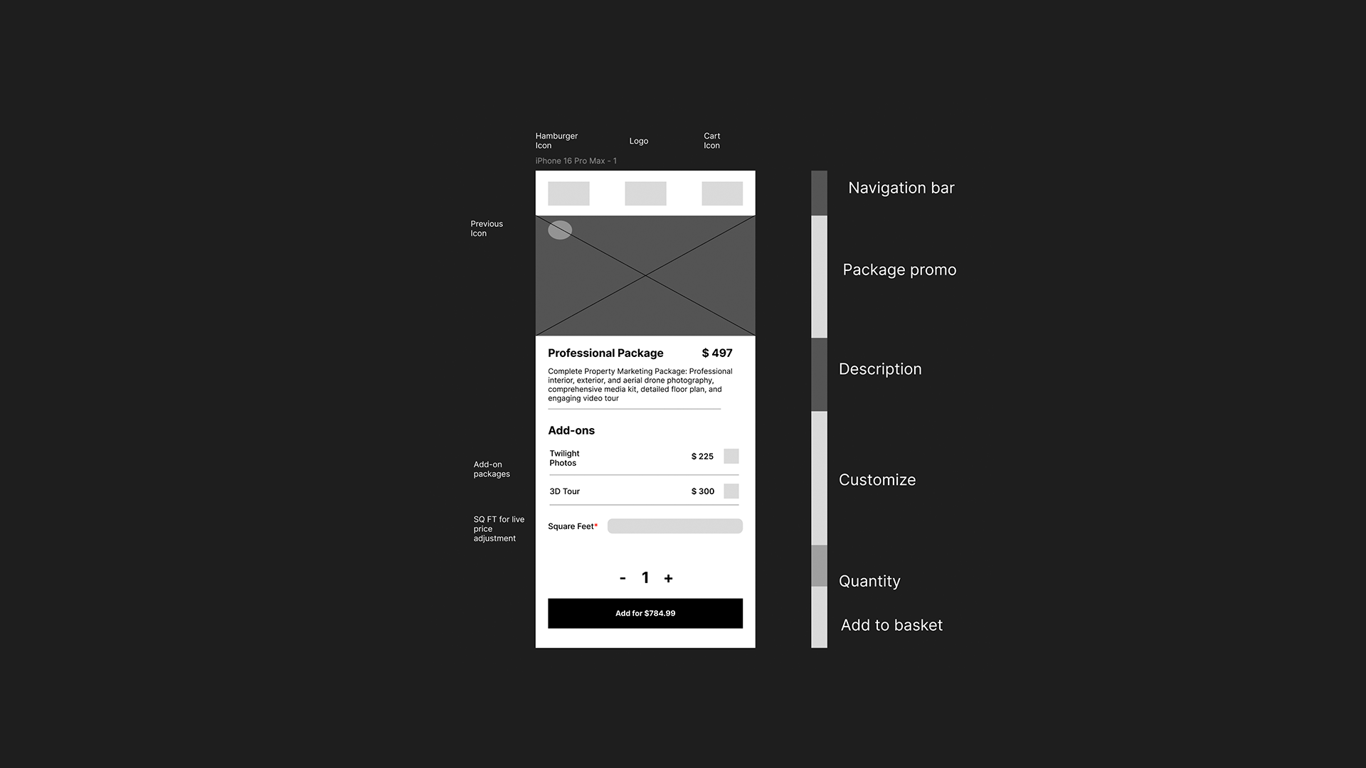
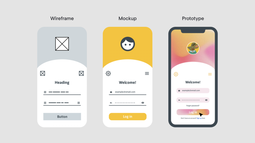
Some of the concepts I’ve been learning about have involved creating wireframes. Wireframing is the process of creating a template that you would design before a full MVP. It is used for testing basic outlines and templates of interfaces before they’re fully built with information and images.
Along with wireframes, I’ve been learning about interface prototyping; prototypes are a more polished look of the app, and they are eventually being built to become the MVP.
Some really neat features of Figma I’ve learned from the course are micro animations and micro interactions. Micro-interactions are a way of engaging with the user to make the user feel more accomplished in small tasks, for example. When you double tap an image on Instagram, it will show a heart emoji animation over the image you tapped.
You can do basic animations with buttons, hover, tap, and mouse exit detections. With it, you can do simple button-click animations and basic scrolling animations.
Somewhat related: Here’s a great post I read on recreating Facebook’s microinteraction feature discovery in basic CSS
This is one of the many installments in my blog series covering (MFED) the Meta Front-End Development course available on Coursera.org
Leave a Reply